Let’s say we want a reall big, chunky main title for our forum skin.
Here’s, I think, the simplest way to do it, I see this a lot:
.maintitle {
  height: 160px;
  line-height: 160px;
  text-align: center;
  font-size: 40px;
}

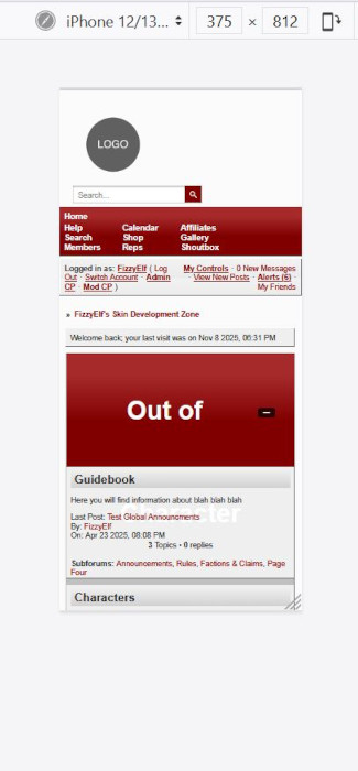
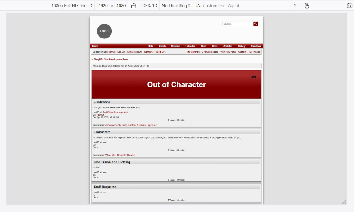
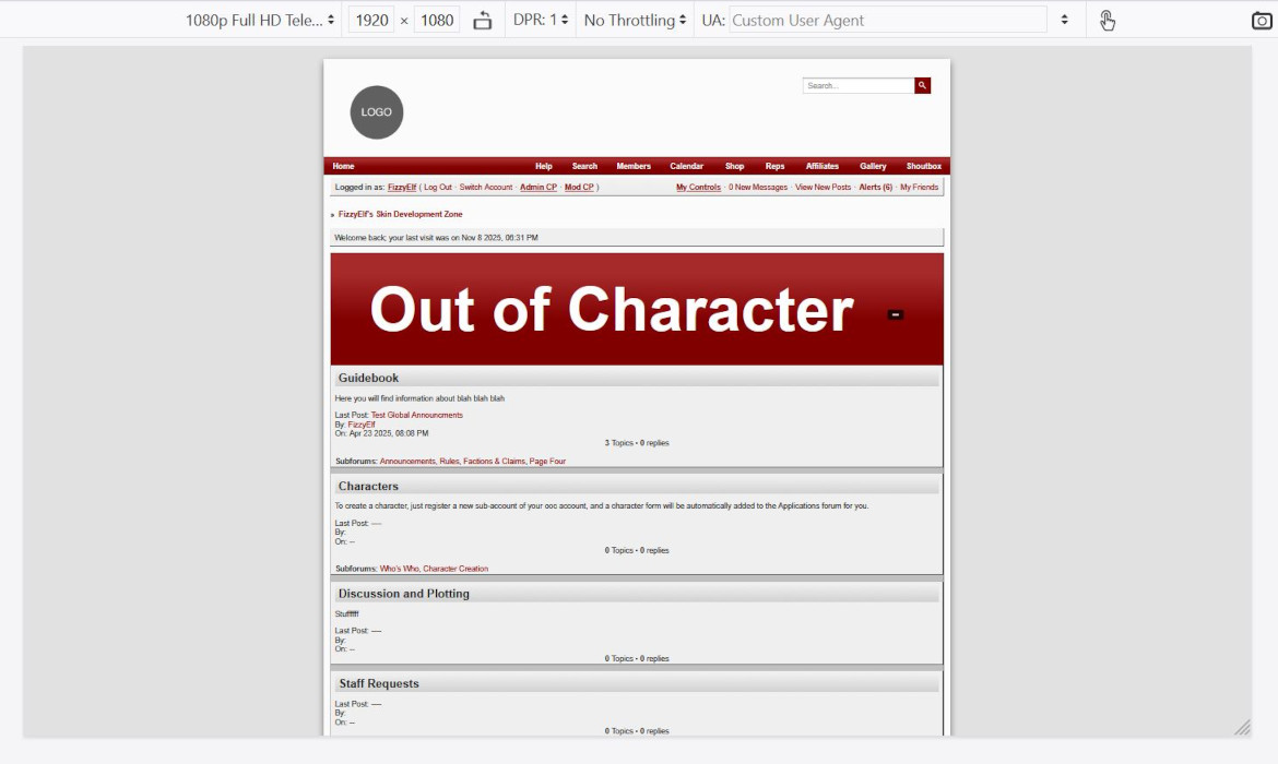
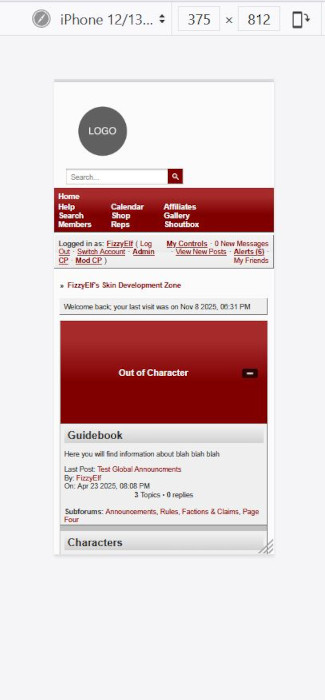
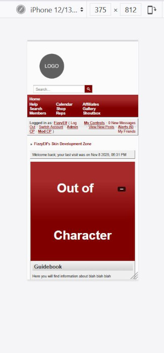
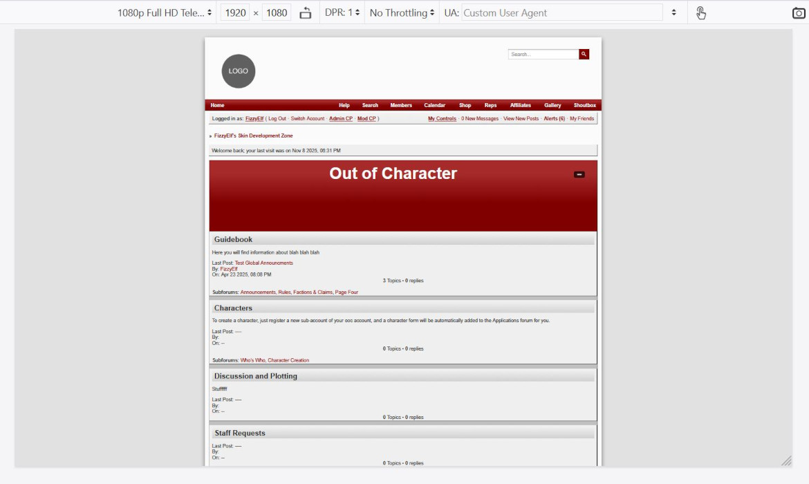
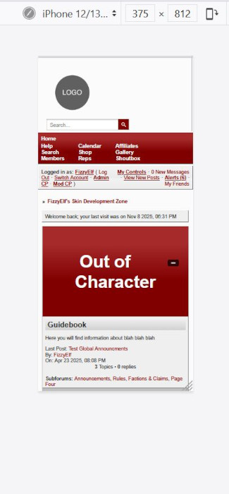
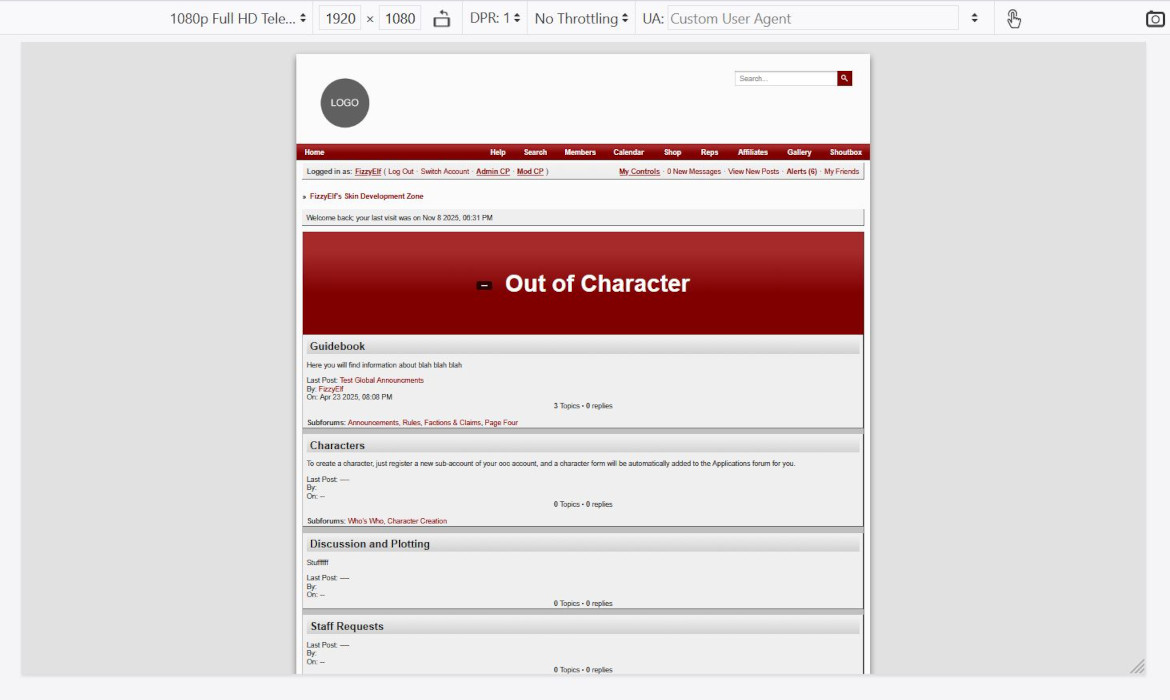
If we add that to the stylesheet and check it on desktop, it looks great. That gradient could be a background image or you could have some text effects, whatever. However if we now go look at it on a phone…. well that’s a problem.
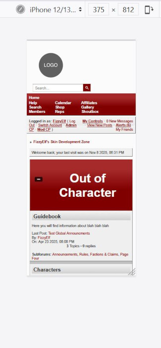
So first of all, lets change the font size so we can get the whole title visible at once. The ‘default’ font-size for an h1 heading is 2em – that is, twice the size of the general paragraph text around it. So let’s start there – and that fits on the phone, but we do still want to have it display at that bigger size when the space is available.
.maintitle {
  height: 160px;
  line-height: 160px;
  text-align: center;
  font-size: 2em;
}
To do that, we are going to have to set the size in a unit that scales with the screen size, either vh – viewport height – or vw – viewport width.
In order to make the text fit without wrapping as much as possible, it makes sense to link it to the width of the screen. So that means vw units. 1 vw is 1% of the viewport width, and we say viewport rather than screen becase the reference is the inner size of the browser window, not the monitor size. And that means it respects both resizing your browser window and changes to the zoom settings.
Since vw is just the % of the full width, when it comes to box sizes, you can usually eyeball it and then adjust, but for font sizes it’s usually easier to just do a bit of math. I can see that this phone I’m emulating is 320 px wide, and I can go into developer tools and see that the 2em in this case is 24 px. So this font size on this size screen, is 24 divided by 375, which is 6.4%
Now on the other screen we were looking at, the desktop size, that was 1920px wide. And we had it set as 40px before. So 40 divided by 1920 is 2%.
That means my first guess for the font size that I want for the responsive font size is – split the difference, more or less, and say 4vw.
.maintitle {
  height: 160px;
  line-height: 160px;
  text-align: center;
  font-size: 4vw;
}
That’s now too big on desktop and too small on mobile, but if we go somewhere in the middle – let’s say an ipad – then that’s not too bad. So we actually have three font sizes – a maximum, 40px, a miniumum, 2em, and a sort of average that scales with the screen size, which is 5vw. This is where the clamp function comes in.
.maintitle {
  height: 160px;
  line-height: 160px;
  text-align: center;
  font-size: clamp(2em, 5vw, 40px);
}

So that’s the font size taken care of, though any of those three values could be dialed in further, or adjusted again after you pick a fancier font or something, but that’s at least the overview of how to make the font-size responsive.
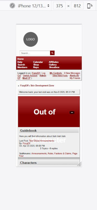
But we still need to keep in mind that there could be a longer category name somewere on the board – especially if you’re making skins for someone else – or someone could have an even smaller phone than this, or have turned up their screen zoom through the accessibility settings, or what have you, so we do still need to make sure that the text can wrap without overflowing the height of the box it’s in – and by the way, this is also the same issue you might have with thread titles which may or may not have a description under them, but you still want the text centered vertically in this type of maintitle.
I’m going to turn up that minimum font size a bit just to force this to wrap, so we can actually see how to solve that issue:
.maintitle {
  height: 160px;
  line-height: 160px;
  text-align: center;
  font-size: clamp(3.5em, 5vw, 40px);
}
The first obvious thing to change is where I set height in px, we can change that to min-height:
.maintitle {
  min-height: 160px;
  line-height: 160px;
  text-align: center;
  font-size: clamp(3.5em, 5vw, 40px);
}
That at least makes the whole thing visible, but that massive line-height is definitely a problem, and if we simply take that out, we loose the vertical centering:
.maintitle {
  min-height: 160px;
  /*line-height: normal;*/
  text-align: center;
  font-size: clamp(3.5em, 5vw, 40px);
}
There are two other ways to vertically center content, and both of these work when there’s a possibility of line-wrapping.
The first one is to put in padding, instead of a height. The thing you have to remember with that, is that when you set a height, it doesn’t include the padding – unless you mess with box-sizing, technically, that won’t help us get anything centered vertically, so the height, line height, min-height, all of that has to go, and we’ll replace it with a padding rule:
.maintitle {
  /*height: auto;*/
  /*line-height: normal;*/
  text-align: center;
  font-size: clamp(3.5em, 5vw, 40px);
  padding: 60px 0;
}
This will behave the way you might expect min-height to work – if there’s one line of text, it’ll show the height we had set before, and if the text wraps, then it’ll expand to fit, but without that crazy gap between the lines.
The second method uses flexbox. This will be a little more fixed-height in it’s behaviour – we’ll set the height of the box, allow the text to wrap with a normal line-height if it needs to, and then get flexbox to center the text in the box regardless of how much text there is. I’m still going to use min-height instead of height just in case something ends up wrapping to more than two lines, it will make sure that it never overflows, but it should be able fit a couple of lines of text into that original 160px height before it has to expand it.
When using display:flex, justify-content is used to set the horizontal (inline) alignment, and align-items is used to set block vertical (block-direction) alignment. (If the flex-direction is set to column those directions switch, but when you want content centered in both directions it’s not particularly important to remember which is which.)
.maintitle {
  min-height: 160px;
  /*height: auto;*/
  /*line-height: normal;*/
  text-align: center;
  font-size: clamp(3.5em, 5vw, 40px);
  display: flex;
  justify-content: center;
  align-items: center;
}
One thing you may have noticed, is that you can’t float a flex element, so the button to expand or collapse the category is now in front of the title rather than off to the right. So if that’s something you’re using, you might prefer the padding method rather than flexbox, or you could use absolute positioning rather than float:
.maintitle {
  min-height: 160px;
  text-align: center;
  font-size: clamp(3.5em, 5vw, 40px);
  display: flex;
  justify-content: center;
  align-items: center;
  position: relative;
  padding: 0 1em;
}